DataViz Battle for the month of March 2019. The interactive visualization is available here, and it was built using R and the packages Shiny, ggplot2 and leaflet. Every month, the subreddit r/dataisbeautiful/ challenges people across the globe to work with a new dataset. These challenges range in difficulty, filesize, and analysis required. What I love about this competition is the freedom it gives the participants to visualize the dataset.
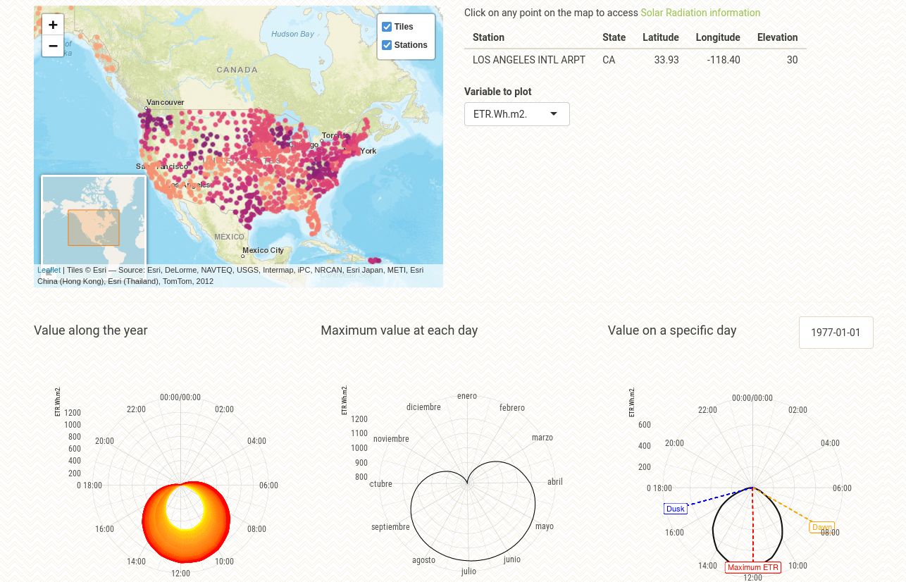
Typical meteorological year (TMY) stations over all United States were included as circle-markers in an interactive map built with the library Leaflet for R. When an station is hovered, information such as name, location, state and class is pop-up. Moreover, when an station is clicked, the server loads the corresponding .csv data file about that station. The solar radiation data is visualized on three different polar graphs. The user can select the variable of interest from the input selector.
Date |
Mar 2019
Technologies |
r
·
shiny
·
leaflet
·
ggplot2
·